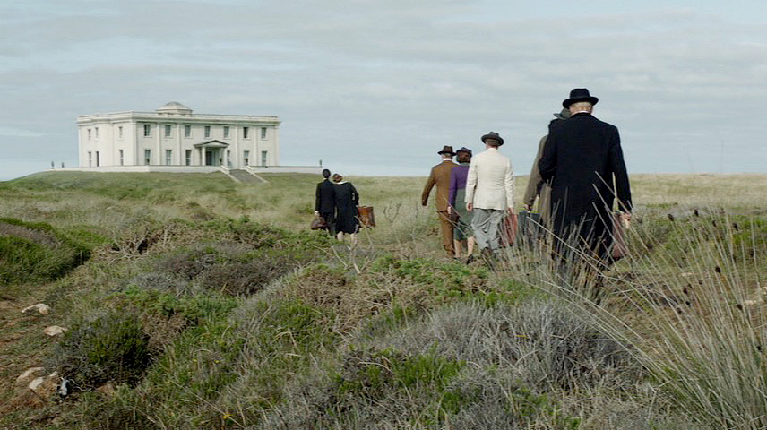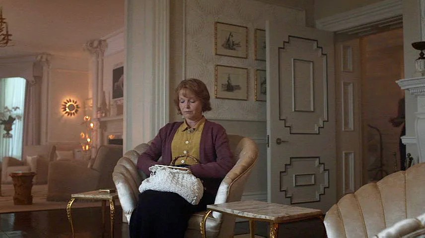
And Then There Were None is a 2015 British-American murder mystery based on Agatha Christie’s novel of the same name. Rewritten and adapted for the small screen by Sarah Phelps, the three-part series needed to reflect the subject matter, wrong-doers being picked off one by one on a remote island. The house and its interiors played a very important part by evoking an eerie, but elegant, atmosphere. So I purchased the DVD in order to capture stills and study the wonderful interiors. I also wondered how the production designer Sophie Becher and her team accomplished this. What I discovered, I will now share with you.
Sophie Becher, the production designer, explains how she created the very individual look for the series:
“It’s well-known that Agatha Christie wrote the book around Burgh Island, which is a classically Art Deco house on an island. Because there have been so many Agatha Christie adaptations set in 1930’s, and because this is a really dark piece, Craig Viveiros, the director, and I both wanted to move away from that very Art Deco feel and open this up a bit.”
“The writer, Sarah Phelps, described the house in detail including an all-white room. I immediately thought of the designer Syrie Maugham, who was married to Somerset Maugham, who was famous in the thirties for designing the first all-white room. I also liked her because she’s slightly surrealist, so because there is a surreal feel to this piece I felt she was very appropriate to the design. She was my starting point but I delved into a lot of other designers of the period and the philosophy behind how people were decorating their houses, stripping out all the old Victoriana and using quite unusual objects in their houses.”
“It was a time of slightly ‘make-do’, and people like Syrie were putting real rope on the wall to make an architrave and this appealed to me so I was very inspired by a lot of her stuff. Another designer, Elsie de Wolfe, who is 1930s period and had all these crazy bohemian parties, which again I was looking at, while trying to build up an image of this house which is very much a character within the plot. I wanted each room had to have an atmosphere which would enhance the story.”
“I had the idea that they are stuck on this island so the drawing room would be like an oasis that you can’t get away from; the trees closing in on you. Every object I chose very carefully; if it had mirror on it, it was reflecting the people, the frames of pictures were bamboo, the backs of doors are pleated like palm leaves, the wallpaper that looks like palm leaves so the subtle jungle theme is there throughout that room. Then with the library, Craig and I were keen that it wasn’t a dark old wooden library so we wanted it to have plants. So I was thinking about conservatories and garden rooms and that’s why the trellis came up – it’s like a cage!”
“We very much had a theme of day and night throughout the piece; as though they are all stuck on this floating pontoon in the middle of the sea where one side is night and the other side is day so that was my brief for designing the mural in the dining room Rex Whistler style.”
“Objects wise, we went out to markets, local auctions and shops and eBay buying as opposed to going to prop houses as I wanted it to have this slightly odd, particular feel. I had this very specific idea in my head about the type of objects that should go in each room. This carries through to the bedrooms where each character’s room was very much designed with them in mind, albeit subtly. For example, Lombard has a cupboard that’s very African, like it’s a tribal sculpture; Blore had stripes and a barred bed because of the prison connection. I searched everywhere for chrome and silver for Armstrong’s room – his bed is the only chrome bed and coat stand, it’s very clinical. Again, with the upstairs we carefully thought about what colours enhance the emotional pitch of the journey but also little suggestions subliminally.”
“The team worked very hard together to design a set that absolutely choreographically worked with the script. It’s like a theatre piece – somebody enters right, the next left and the whole way the story is written, and the way Sarah adapted it, there were some absolute prerequisites. This isn’t set in a stately home, it’s set in an extraordinary house and in the book they say it belonged to rich Americans who had left their mark so I had this slight Gatsby style house in my head. Immediately when I read the script, I had a vision of a slightly strange, slightly nouveau-ish house that on the surface is stunning, but is actually really unsettling. It’s nothing you can describe and it’s not rooted in any period in particular, it has its own identity.”
“Although I have taken absolute reference from the Thirties I have created something that is completely individual to the story. We’ve been really lucky in that we’ve had a total blank canvas to build that up on. There’s always things I would say I would do if I had more money but I think we’ve achieved it.”
“Regarding the figures that represent each person stranded on the island I started looking at a lot of sculptors that had done these Cycladic figures from the period, but also contemporary sculptors too. We felt the figures would be quite good if they were cubist and abstract. Each figure we made has been made around the characters in themselves, but based on the theme. There’s arrogance, greed, judgement which is Wargrave, envy, piousness which is Emily. The audience won’t notice that when watching, but it always helps when designing to have concept in mind so then you can get a character out of these little figures. Craig very much wanted them to be standing on a circular metal disc like the sun or moon, and I wanted it to be shiny so the figures reflected in the disc. These figures which we cast in resin then made to look like jade are each on a shaped base, but the bases all slot together like a jigsaw. So again if you break the jigsaw, how can you piece it back together? You can’t once one piece has gone!”
“And lastly the rhyme which is in everyone’s room. Because it’s the only piece of art in anyone’s bedroom I felt it couldn’t be a typed out little list on the wall, so in order to hide it in a way that when you first see it you think it’s a decorative piece, I wanted it to have a design around the edge and not just be the text. Philippa Broadhurst, our graphic artist, went to great lengths to take every element of the poem but also subtle elements of each character and their crimes and build it up into a border around the edge. It’s done in the style of Rex Whistler and illustrators of the period.”


In the video below, the set designer, Sophie Becher, takes us on a tour of the house used in And Then There Were None and explains how the decoration, design, and props were carefully chosen to reflect the characters and the period.
I think the coffered ceiling in the dining room would have worked fine; either mirrored within along with the same paint color as muraled walls or painted with gold detail like the French gold/cream pedestal.
Loved this commentary- really captures the work. While watching the series there is absolutely something odd and offputting about the interiors that one cannot quite put ones finger on, very subtly done and effective while capturing the mood of the time.